Custom Forms
When creating a Slide or Presentation, custom data can be captured for use within iDetailAid or exported into a 3rd party platform such as Veeva Vault.
This data can be accessed by the slide content itself, HTML packages within the slide, as well as by the publisher when exporting to 3rd party systems.
A common use-case would be to allow the content creator to choose settings from a dropdown which will be exported into a 3rd party system such as Veeva Vault.
Example
A slide form will appear in the Slide Properties panel under the general tab.
Example
Slide Form Example](../images/custom-forms/slide-form-example.png){:target="_blank"}
Where is the data stored ?
Each forms is assigned a namespace, and any data saved against that form will be saved against that namespace within the meta property of the Slide or Presentation object.
For example, if a slide form had a namespace of my_settings, and it contained a text field named my_value, when the user enters data and saves the slide, it would store the data in the slide object like so:
{
    "id": 10,
    "title": "My New Slide",
    .....
    "meta":{
        "my_settings":{
            "my_value":"User entered text"
        }
    },
    ....
}
The namespace allows for clear segregation of data, and prevents any property clashes.
Accessing this from an HTML package, you could run the following JS code.
if( ida.slide.meta.my_settings.my_value == "hello" ) {
    alert('Hello');
}
Configuration
The form is defined by a JSON document, and is saved in the admin/config area of the CMS, under Custom Forms.
Like other config areas, this can be applied at a system, company, product or regional level.
Example
Divider Example](../images/custom-forms/admin.png){:target="_blank"}
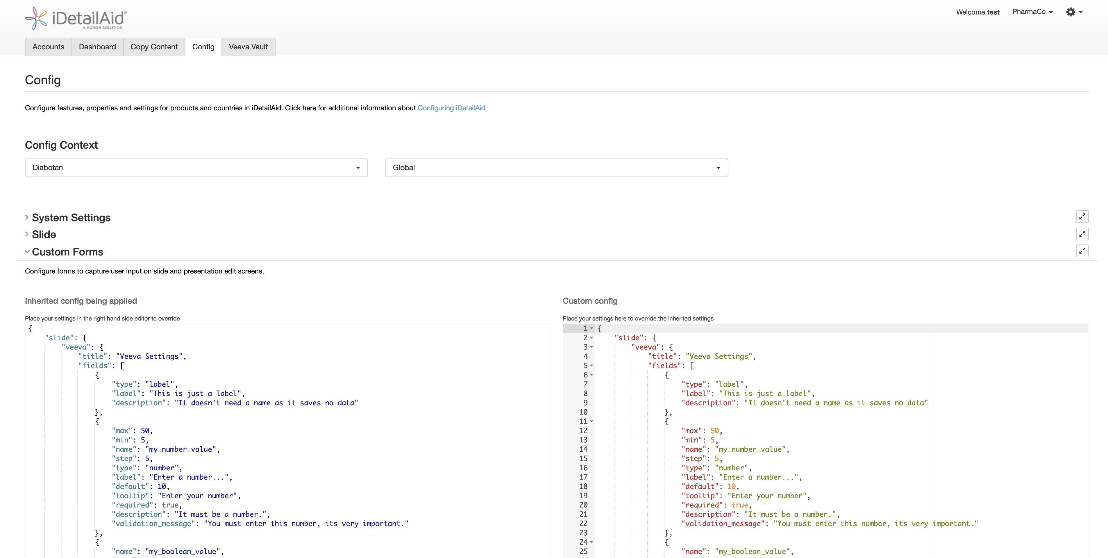
Defining where the form appears
The top level nodes in the document define the area of the UI that the form should appear in.
| property | type | description |
|---|---|---|
| slide | Object |
The Slide editor |
| presentation | Object |
The Presentation editor editor |
{
    "slide": {...},
    "presentation": {...}
}
Each object then contains the form definition, stored under a namespace.
Form Namespace
You can insert more than one form into each area. Forms are assigned a namespace, and any data saved against that form will be saved against the namespace with in the meta property of the slide or presentation.
See Where is the data stored ?
Form options
Title and description
You can set a form heading and an optional description for each form namespace.
{
  "title": "Veeva Settings",
  "description": "You can update the following fields in vault",
  "fields": [...]
}
Example
Fields
The form fields are defined in the fields array. Each entry is an object defining a form element.
In the case of a presentation form, you can specify 2 groups, fields_group_1 and fields_group_2.
fields_group_1 appears on the left column of the presentation form, and fields_group_2 appears on the right. If you just define fields, then they all appear on the left.
Form Element Properties
Common Element Properties
Each form element can have the following fields (excluding label and divider)
| property | type | description | required |
|---|---|---|---|
| type | string |
The type of form element | required |
| name | string |
The property name that the data is saved under | required |
| label | string |
The display label for the form element | optional |
| tooltip | string |
The tooltip to show when hovering over the form element | optional |
| required | boolean |
If the field is required. This will prevent the Slide / Presentation from saving if the user has not entered a value | optional |
| default | mixed |
A default value | optional |
| description | string |
A description of the element | optional |
| validation_pattern | string |
A regEx to run to validate the field | optional |
| validation_message | string |
An error message to show if the validation regEx fails | optional |
| style | string |
CSS styling added to the style attribute of the element |
optional |
{
    "type": "text",
    "name": "my_text_value",
    "label": "First name",
    "tooltip": "Dont enter a space",
    "required": true,
    "default": "",
    "description": "Enter your name with NO spaces",
    "validation_message": "Please do not enter any spaces",
    "validation_pattern": "\\S*$",
    "style": "width:50px"
}
Specific Element Properties
The standard HTML attributes used to customise a form element can also be set as properties. For example;
- A
numberelement will acceptminandmaxproperties. - A
textelement will acceptminlengthandmaxlengthproperties. - A
textareaelement will a acceptrowsandcolsproperties.
Any supported HTML form attributes can be added to the element config.
Element Types
Divider
Inserts a horizontal divider.
{
  "type": "divider"
}
Example

Label
Inserts a label, with an optional description
{
  "type": "label",
  "label": "This is just a label",
  "description": "It doesn't need a name as it saves no data"
}
Example

Text
Inserts a label, with an optional description
{
  "type": "text",
  "name": "my_text_value",
  "label": "First name",
  "tooltip": "Dont enter a space",
  "required": true,
  "maxlength": 100,
  "minlength": 10,
  "description": "Enter your name with NO spaces",
  "placeholder": "enter your name",
  "validation_message": "Please do not enter any spaces",
  "validation_pattern": "\\S*$"
}
Example

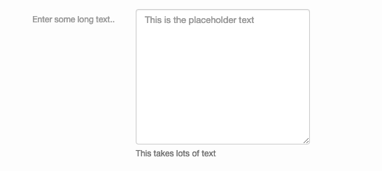
Textarea
Inserts a textarea
{
  "type": "textarea",
  "name": "my_textarea_value",
  "cols": 20,
  "rows": 10,
  "wrap": "hard",
  "label": "Enter some long text..",
  "tooltip": "Enter some text",
  "required": true,
  "maxlength": 300,
  "description": "This takes lots of text",
  "placeholder": "This is the placeholder text",
  "validation_message": "You must enter some text"
}
Example
Number
Inserts a number stepper
{
  "type": "number",
  "name": "my_number_value",
  "max": 50,
  "min": 5,
  "step": 5,
  "label": "Enter a number...",
  "default": 10,
  "tooltip": "Enter your number",
  "required": true,
  "description": "It must be a number.",
  "validation_message": "You must enter this number, its very important."
}
Example

Checkbox
Inserts a checkbox
{
  "type": "checkbox",
  "name": "my_boolean_value",
  "label": "Training content",
  "default": true,
  "tooltip": "Its a checkbox",
  "description": "Do you want to check this?"
}
Example

Radio Group
Inserts a radio group
{
  "type": "radio",
  "name": "my_radio_value",
  "label": "A radio group",
  "options": [
      1,
      {
          "label": "Two",
          "value": 2
      },
      {
          "label": "Three",
          "value": 3
      },
      4,
      5
  ],
  "tooltip": "Please choose a value",
  "required": true,
  "description": "Choose one!"
}
Example

Select
Inserts a Select picker
{
  "type": "select",
  "name": "my_mulitple_select_value",
  "label": "Countries",
  "options": [
      1,
      {
          "label": "Two",
          "value": 2
      },
      {
          "label": "Three",
          "value": 3
      },
      4,
      5
  ],
  "tooltip": "Please choose a value",
  "multiple": true,
  "required": true,
  "description": "Pick more than one!",
  "placeholder": "Choose a value from this list..."
}
Example

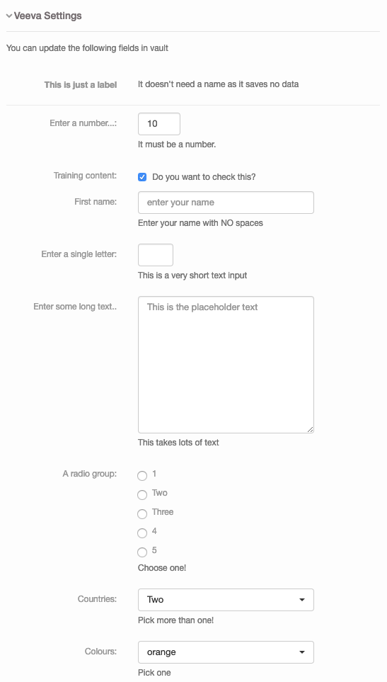
Full example
{
  "slide": {
    "veeva": {
      "title": "Veeva Settings",
            "description": "You can update the following fields in vault",
      "fields": [
        {
          "type": "label",
          "label": "This is just a label",
          "description": "It doesn't need a name as it saves no data"
        },
        {
          "max": 50,
          "min": 5,
          "name": "my_number_value",
          "step": 5,
          "type": "number",
          "label": "Enter a number...",
          "default": 10,
          "tooltip": "Enter your number",
          "required": true,
          "description": "It must be a number.",
          "validation_message": "You must enter this number, its very important."
        },
        {
          "name": "my_boolean_value",
          "type": "checkbox",
          "label": "Training content",
          "default": true,
          "tooltip": "Its a checkbox",
          "description": "Do you want to check this?"
        },
        {
          "name": "my_text_value",
          "type": "text",
          "label": "First name",
          "tooltip": "Dont enter a space",
          "required": true,
          "maxlength": 100,
          "minlength": 10,
          "description": "Enter your name with NO spaces",
          "placeholder": "enter your name",
          "validation_message": "Please do not enter any spaces",
          "validation_pattern": "\\S*$"
        },
        {
          "name": "my_short_text_value",
          "type": "text",
          "label": "Enter a single letter",
          "style": "width:50px",
          "maxlength": 1,
          "minlength": 1,
          "description": "This is a very short text input"
        },
        {
          "cols": 20,
          "name": "my_textarea_value",
          "rows": 10,
          "type": "textarea",
          "wrap": "hard",
          "label": "Enter some long text..",
          "tooltip": "Enter some text",
          "required": true,
          "maxlength": 300,
          "description": "This takes lots of text",
          "placeholder": "This is the placeholder text",
          "validation_message": "You must enter some text"
        },
        {
          "name": "my_radio_value",
          "type": "radio",
          "label": "A radio group",
          "options": [
            1,
            {
              "label": "Two",
              "value": 2
            },
            {
              "label": "Three",
              "value": 3
            },
            4,
            5
          ],
          "tooltip": "Please choose a value",
          "required": true,
          "description": "Choose one!"
        },
        {
          "name": "my_mulitple_select_value",
          "type": "select",
          "label": "Countries",
          "options": [
            1,
            {
              "label": "Two",
              "value": 2
            },
            {
              "label": "Three",
              "value": 3
            },
            4,
            5
          ],
          "tooltip": "Please choose a value",
          "multiple": true,
          "required": true,
          "description": "Pick more than one!",
          "placeholder": "Choose a value from this list..."
        },
        {
          "name": "my_select_value",
          "type": "select",
          "label": "Colours",
          "default": "yellow",
          "options": [
            "infrared",
            "red",
            "orange",
            "yellow",
            "green",
            "blue",
            "indigo",
            "violet",
            "ultraviolet"
          ],
          "tooltip": "Please choose a value",
          "required": true,
          "description": "Pick one"
        }
      ]
    }
  }
}
Example