Product Styles
Each product within iDetailAid has a pre-defined set of styles comprised of CSS, metadata and images.
These determine the text styles, colours, fonts, overlays and navigation types that are available for content creators.
Structure
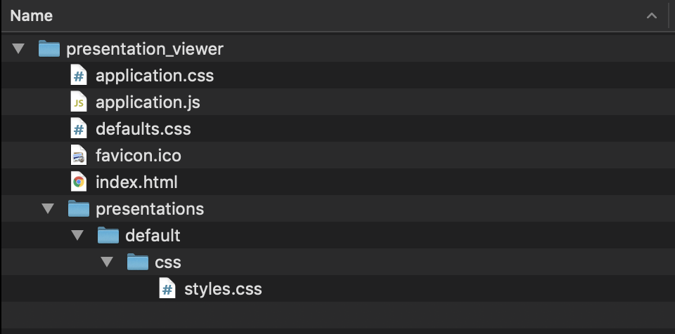
The product style definitions are located in the main Presentation Viewer. The Presentation Viewer is a standalone web application responsible for rendering iDetailAid-generated content.
Each product and region has its own Viewer, and the styling is defined in the viewer's presentations/default folder.
Viewer File Structure
styles.css
The Presentation Viewer will load a single style sheet for the current presentation from the following path:
./presentations/default/css/styles.css
Required
The only requirement is that styles.css must include the defaults.css file before declaring any subsequent styles.
/* This must come before any other declarations */
@import url('../../../defaults.css');
How the remaining CSS is defined and/or structured is a matter or choice.
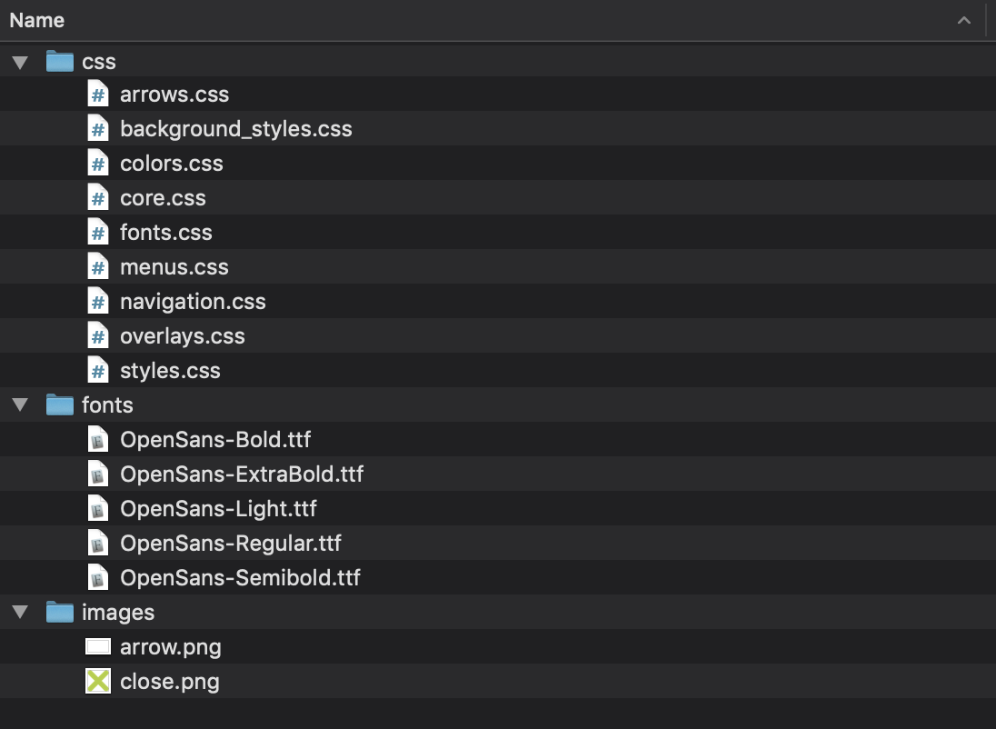
iDetailAid recommends that each logical element (e.g. navigation or overlays) is broken out into a separate CSS file and either imported (@import()) into the main styles.css, or compiled down into a single styles.css file, using a CSS preprocessor such as sass or less.
Do not embed defaults.css
The defaults.css must be imported as an external file as it is generated by the iDetailAid platform and is updated with each release.
/* This must come before any other declarations */
@import url('../../../defaults.css');
A typical pure CSS implementation would look like this:
Typical Product File Structure
@import url('../../../defaults.css');
@import url('core.css');
@import url('fonts.css');
@import url('background_styles.css');
@import url('navigation.css');
@import url('overlays.css');
@import url('arrows.css');
@import url('menus.css');
@import url('colors.css');
defaults.css
The defaults.css file contains all the base styling to layout an iDetailAid slide correctly. If and of this needs modification, it should be override it in the product specific CSS declarations.
Refer to defaults.css to see how certain elements are styled and how to override the declarations.
Class prefixes and selectors
.slide
ALL selectors must be prefixed with .slide.
If this is overlooked, there may be some detrimental impact to the iDetailAid authoring interface.
Do
.slide .main-title {
    font-size:20px;
    color:blue;
    font-family:'Arial';'
}
Don't
.main-title {
    font-size:20px;
    color:blue;
    font-family:'Arial';'
}
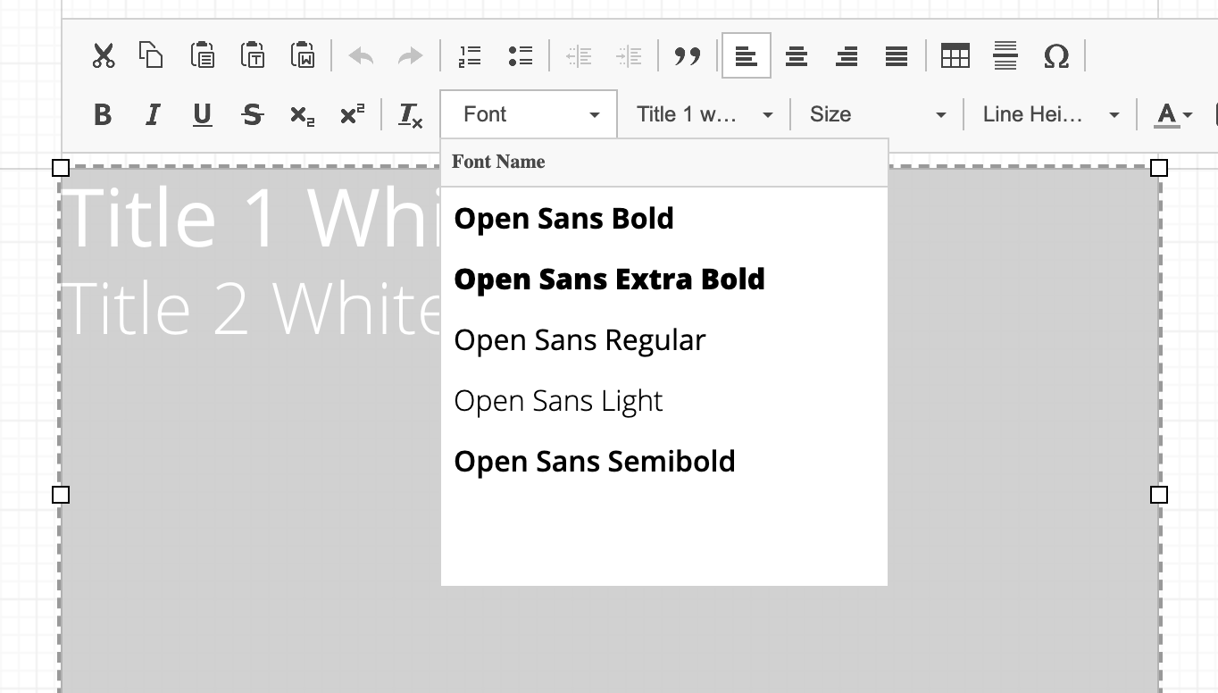
.styles-menu
The .styles-menu selector specifically targets the preview in the Styles drop down menu in the editor
Styles menu
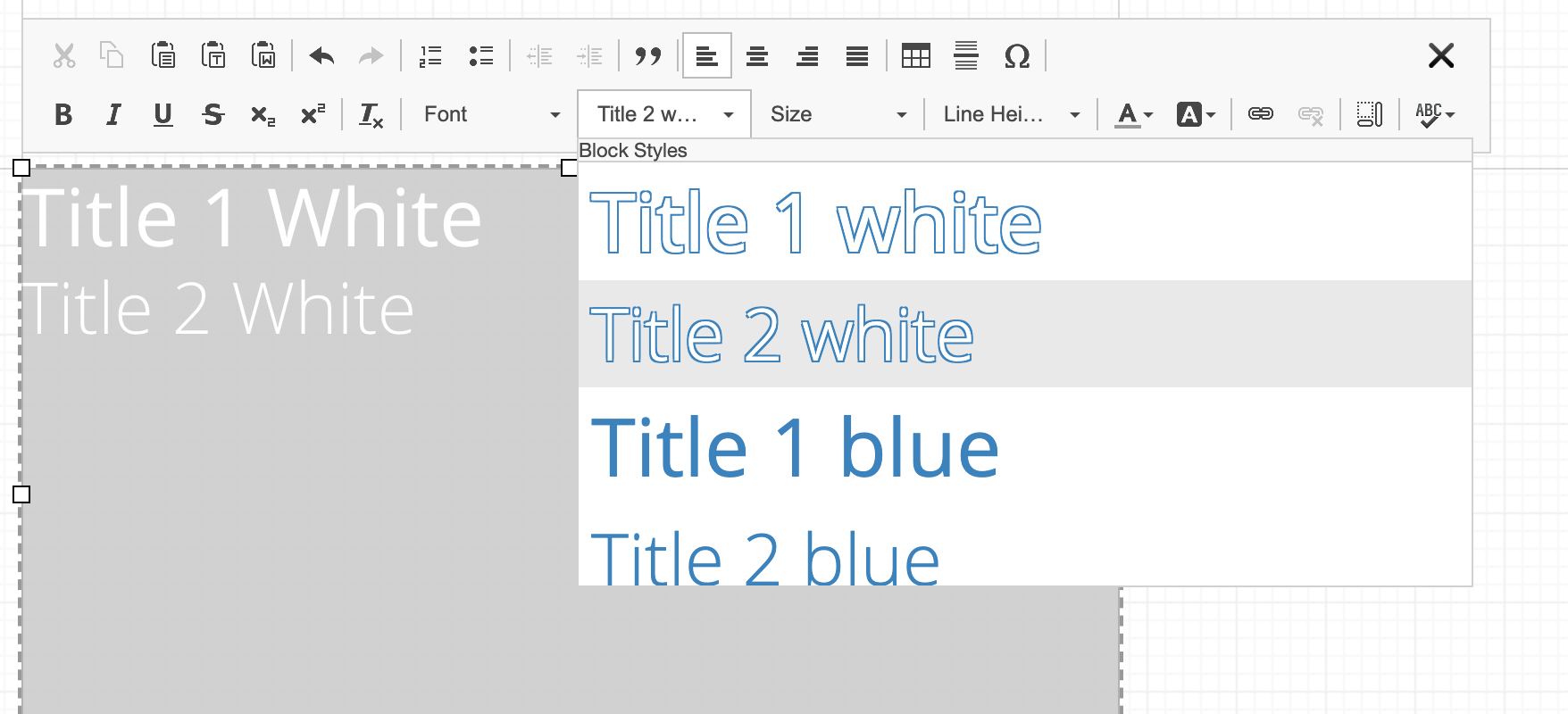
This allows you to change the text display just for the preview. As per the above example, the top two titles are white, and would not show up on a white background.
To overcome this, the following style will add a blue border, but ONLY to the text when shown in the styles drop down menu.
.slide .title-1-w, .slide .title-2-w {
    color: #ffffff;
    font-family: 'Open Sans Regular';
}

.slide .title-1-w {
    font-size: 45px;
}

.slide .title-2-w {
    font-size: 40px;
}

/* Add an outline to the white text in the styles menu */
.slide.styles-menu .title-1-w,
.slide.styles-menu .title-2-w {
    text-shadow: -1px -1px 0 #1a83c2,  1px -1px 0 #1a83c2, -1px 1px 0 #1a83c2, 1px 1px 0 #1a83c2;
}
body.viewer
The body.viewer class is only present in the Presentation Viewer, which allows you to create a style that is only applied when in the Presentation Viewer, and NOT applied when in the iDetailAid Slide editor
body.modal-open
The body.modal-open class is assigned to the body when the the overlay modal window is open. This allows you to add effects such as a blur to the slide content when a overlay is open.
body.viewer.modal-open .presentation .slide>.content{
   -webkit-filter: blur(5px);
}
Configuration blocks
To define the styles menu items, the available colours, the background styles etc, you add comment blocks to the CSS files.
The comment blocks can appear anywhere, and in any .css file in the styles folder. It can be useful to include them above each class declaration that they relate to.
Each block defines the section of the UI where the item will be available, and any other custom properties required.
Taking the styles menu above as an example, to add the first two styles you would add the following comments.
.slide .title-1-w, .slide .title-2-w {
    color: #ffffff;
    font-family: 'Open Sans Regular';
}

/**
 * @section slide.text_styles
 * @name Title 1 white
 * @class_name title-1-w
 */

.styles-menu .title-1-w {
    font-size: 45px;
}

/**
 * @section slide.text_styles
 * @name Title 2 white
 * @class_name title-2-w
 */
.styles-menu .title-2-w {
    font-size: 40px;
}
However, you could include these in a separate file un related to the actual class declarations.
See below for the available properties for each section's comment block.
Sections
Slide
Text Styles
Defines styles that appear in the Slide editor > text editor > styles menu.
Styles menu
Available attributes
| Attribute | Example | Description |
|---|---|---|
@section |
slide.text_styles |
The Styles menu in the slide text editor |
@name |
Title 1 white | The display name of the item |
@class_name |
title-1-w |
The class to apply to the selected text |
@element |
h1 |
Optional tag name of the DOM element that will contain this style. Default is div |
/**
 * @section slide.text_styles
 * @name Title 1 white
 * @class_name .title-1-w
 */
.slide .title-1-w {
    color: #ffffff;
    font-family: 'Open Sans Regular';
    font-size: 45px;
}
Colours
Defines the colour palette available in both the slide text editor, and the properties panels.
Editor Colours
Available attributes
| Attribute | Example | Description |
|---|---|---|
@section |
slide.editor_colors |
The available colour palette in the slide text editor and properties panel |
@color_palette |
#1A83C2 #115882 #8CC1E0 #B2CF36 |
Space delimited list of colour hex references |
@disable_color_wheel |
true | Optional flag to enable / disable a free choice colour picker. |
/**
 * @section slide.editor_colors
 * @color_palette #1A83C2 #115882 #8CC1E0 #B2CF36 #7B8F25 #D9E79A #90D8F8 #72ABC4 #CCD0D3 #000000 #FFFFFF
 * @disable_color_wheel false
 */
Fonts
Any @font-face tags found will automatically add an entry to the fonts menu in the slide text editor. There is no need to define any comment blocks.
Fonts
@font-face {
  font-family: 'Open Sans Bold';
  src: url('../fonts/OpenSans-Bold.ttf');
  font-weight: 300;
  font-style: normal;
}

@font-face {
  font-family: 'Open Sans Extra Bold';
  src: url('../fonts/OpenSans-ExtraBold.ttf');
  font-weight: normal;
  font-style: normal;
}

@font-face {
  font-family: 'Open Sans Regular';
  src: url('../fonts/OpenSans-Regular.ttf');
  font-weight: normal;
  font-style: normal;
}
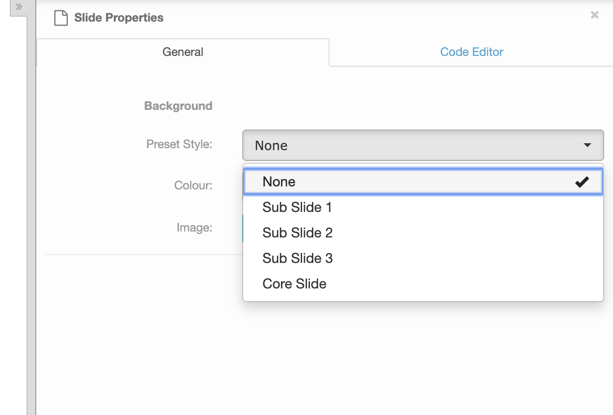
Background Styles
Defines the options that are available for the slide backgrounds menu.
Background Styles
Available attributes
| Attribute | Example | Description |
|---|---|---|
@section |
slide.background_styles |
The available slide background styles |
@name |
Sub slide 2 | The display name of the style |
@class_name |
sub-slide-2 |
the class name of the style to apply to the slide |
/**
 * @section slide.background_styles
 * @name Sub Slide 2
 * @class_name sub-slide-2
 */
.slide div[data-background-style="sub-slide-2"]:before {
  content: " ";
  position: absolute;
  top: 0;
  right: 0;
  left: 0;
  bottom: 0;
  border: 15px solid #CEE4F0;
}

.slide div[data-background-style="sub-slide-2"]:after {
  top: -15px;
  left: 50%;
  border: solid transparent;
  content: " ";
  height: 0;
  width: 0;
  position: absolute;
  pointer-events: none;
  border-color: rgba(136, 183, 213, 0);
  border-bottom-color: #ffffff;
  border-width: 15px;
  margin-left: -15px;
}
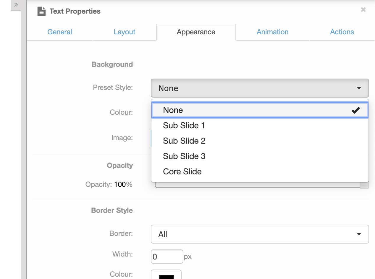
Content Background Styles
Defines the options that are available for a content area's backgrounds menu.
Tip
If you do not define any content area background styles, the slide background styles are used in stead.
Content Area Background Styles
Available attributes
| Attribute | Example | Description |
|---|---|---|
@section |
slide.content_background_styles |
The available content area background styles |
@name |
Sub slide 2 | The display name of the style |
@class_name |
sub-slide-2 |
the class name of the style to apply to the content area |
/**
 * @section slide.content_background_styles
 * @name Blue Box
 * @class_name blue-box
 */
.slide .widget[data-background-style="blue-box"]:before {
  content: " ";
  position: absolute;
  top: 0;
  right: 0;
  left: 0;
  bottom: 0;
  background-color: #1D84BF;
  border: 15px solid #4B9DCC;
}

.slide div[data-background-style="blue-box"] {
  color: #ffffff;
}

.slide div[data-background-style="blue-box"]:after {
  top: -15px;
  left: 50%;
  border: solid transparent;
  content: " ";
  height: 0;
  width: 0;
  position: absolute;
  pointer-events: none;
  border-color: rgba(136, 183, 213, 0);
  border-bottom-color: #1D84BF;
  border-width: 15px;
  margin-left: -15px;
}
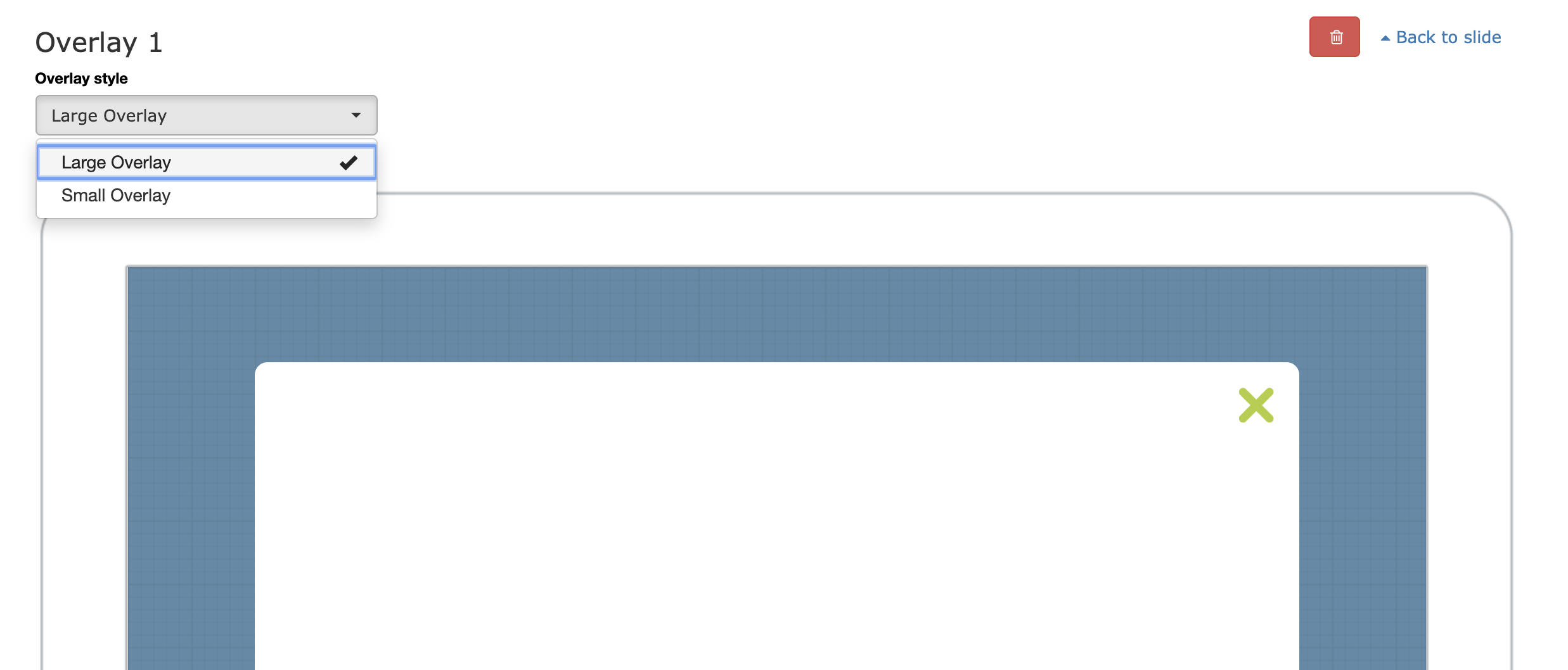
Overlay Styles
Defines the overlay styles, and the options in the overlay style menu.
Overlay Styles
Available attributes
| Attribute | Example | Description |
|---|---|---|
@section |
slide.overlay_styles |
The slide overlay styles |
@name |
Small Overlay | The display name of the style |
@class_name |
sub-slide-2 |
the class name of the style to apply to the content area |
/**
 * @section slide.overlay_styles
 * @name Large Overlay
 * @class_name overlay-large
 */

/**
 * @section slide.overlay_styles
 * @name Small Overlay
 * @class_name overlay-small
*/
 body.viewer.modal-open .presentation .slide>.content{
   -webkit-filter: blur(5px);
 }

.slide .overlay .content {
  background: rgba(17,88,130,0.7);
}

.slide .overlay .content:before {
  border: 0;
  z-index: 0;
  position:absolute;
  background-color: #ffffff;
  opacity:1;
  content:'';
  border-radius: 10px;
}

.slide .overlay[data-overlay-style="overlay-large"] .content:before {
  left: 100px;
  right: 100px;
  top: 75px;
  bottom: 75px;
}

.slide .overlay[data-overlay-style="overlay-small"] .content:before {
  left: 300px;
  right: 300px;
  top: 200px;
  bottom: 200px;
}

.slide .overlay .close {
  position:absolute;
  width: 28px;
  height: 28px;
  background-image: url('../images/close.png');
  background-size: 28px 28px;
  filter: alpha(opacity=100);
  opacity: 1;
}

.slide .overlay[data-overlay-style="diabotan-overlay-large"] .close {
  top: 95px;
  right: 120px;
}

.slide .overlay[data-overlay-style="diabotan-overlay-small"] .close {
  top: 220px;
  right: 320px;
}

.slide .overlay .close span {
  display: none;
}
Navigation Styles
Defines the available navigation bar styles, and optional button styles.
Navigation Types
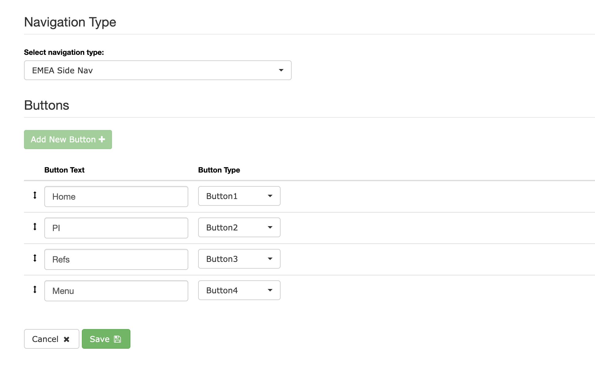
Available attributes
| Attribute | Example | Description |
|---|---|---|
@section |
navigation.types |
The navigation types section |
@name |
Side Nav | The display name of the type |
@class_name |
side-nav |
The class name of the navigation style to apply to navigation bar |
@max_buttons |
4 | Optional restriction on the number of buttons that can be added |
@button_styles |
button1 button2 button3 button4 | optional list of available button styles to choose from for this navigation bar |
Tip
The button style class names are automatically converted to friendly display labels for you.
For example the button class .small-blue-button will display as Small blue button in the menu.
/**
 * @section navigation.types
 * @name Side Nav
 * @max_buttons 4
 * @class_name side-nav
 * @button_styles button1 button2 button3 button4
 */
.navigation.side-nav li {
  display: block !important;
  float: none;
  width: 38px !important;
  height: 38px !important;
  border-right: none !important;
  margin-bottom: 7px;
  margin-top: 7px;
  padding-top: 10px;
}

.navigation.side-nav li.button1{
  background-image: url('../images/abbv.png');
  background-size: 38px 38px;
}
.navigation.side-nav li.button2{
  background-image: url('../images/pi.png');
  background-size: 38px 38px;
}
.navigation.side-nav li.button3{
  background-image: url('../images/imp.png');
  background-size: 38px 38px;
}
.navigation.side-nav li.button4{
  background-image: url('../images/lines.png');
  background-size: 38px 38px;
}
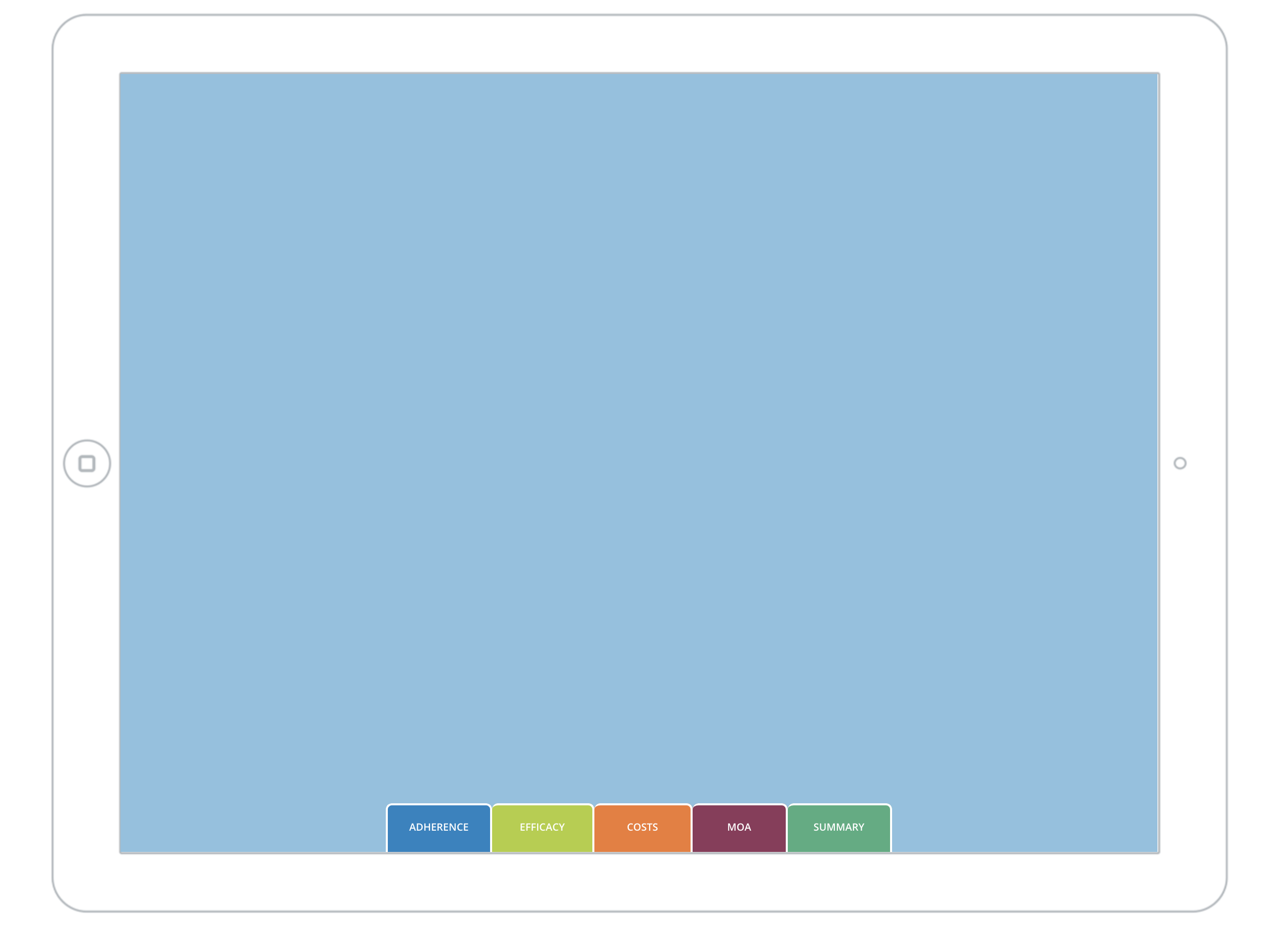
Navigation Preview
The navigation section of the CMS shows a preview of the nav you are building against a slide.
To ensure this previews correctly, you can define the width / height and position of the navigation bar, and style the slide background color.
Use the .nav-preview selector to modify the nav styling.
Navigation Preview
 slide .nav-preview.bottom-nav .navigation {
    position: absolute;
    top: auto;
    left: 50%;
    right: auto;
    bottom: 0;
    width: 500px;
    height: 50px;
    margin-left: -250px;
}

.slide .nav-preview.side-nav .slide-background {
    background-color:#ff00ff;
}